Your cart is currently empty!

Minnesota’s New Flag: A Clearer Symbol, A Complex Legacy
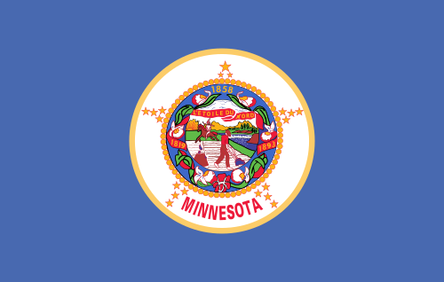
On May 11, 2024, Minnesota officially raised its new state flag, replacing the long-criticized blue banner stamped with the state seal. That day—Statehood Day—marked the symbolic end of an era and the beginning of a new visual identity for the North Star State. The change was overdue: the old flag was nearly indistinguishable from dozens of others across the country and carried with it a problematic iconography rooted in settler colonialism.
The new design is starkly different—abstract, geometric, and modern. But while it succeeds as a flag, it still leaves unresolved the deeper cultural tensions of the land it represents.

A Step Forward in Form, Not in Full Reckoning
While the new design succeeds in abstraction, it sidesteps the opportunity to repair or even acknowledge the deeper historical and cultural exclusions embedded in the state’s identity. Notably, the new flag continues to prioritize Euro-American symbolism through its invocation of the North Star—a directional tool of navigation and expansion, and, arguably, of imperial imposition.
Minnesota, “the Star of the North,” uses Polaris as its motif. While historically romanticized as a guiding light for pioneers and freedom-seekers, the North Star also signifies the logic of the grid—of mapping, measuring, and dividing land. The Cartesian impulse behind it—navigation, demarcation, conquest—was a key mechanism of colonization. Minnesota’s original land divisions, from reservations to township lines, were laid according to this compass-driven logic. The new flag carries that thread forward, even in its elegance.
The Silence of Native Nations
Absent from the new design is any direct acknowledgment of Minnesota’s eleven sovereign tribal nations. Though the process involved some Indigenous advisors, the final image does not reflect Native iconography, language, or land-based relationships that predate statehood. The shape of the flag’s blue field—meant to evoke water—is geographically nonspecific. The star, pointed and sharp, orbits statehood and settlement narratives, rather than centering Indigenous sovereignty or resistance.

It is telling that in removing the most offensive imagery from the original seal—where a white settler plowed land as a Native figure rode away—the state moved toward neutrality, not reconciliation. The violence is no longer explicit. It is simply omitted.
Flags Are Not Just Symbols—They Are Stories
Flags, like all symbols, do political work. The new Minnesota flag tells a cleaner, clearer story—one easier to teach in classrooms and wave at sports games. It unburdens the state of its most obviously colonial iconography without confronting the legacy that iconography represented.
In that sense, it represents a better flag—but not necessarily a braver one.
Minnesota had a chance to lead in vexillological justice by centering Indigenous identity and reorienting the narrative away from statehood and toward shared history. Instead, it reaffirms direction and destiny through a star—a light seen from afar, abstract and unaccountable.
Verdict:
- Design score: 8/10 – Visually successful, highly legible.
- Symbolic depth: 5/10 – Aesthetic wins over historical reckoning.
- Representation: 3/10 – Native presence remains peripheral.
Minnesota may now fly a more beautiful flag—but it still flutters in the winds of its past.

Flag of Calico Jack 3’x5′ – Titus “Gale Force” Heavy Duty Flag – Handmade in USA
Capture the spirit of the high seas with a Titus 3’x5′ Calico Jack Pirate Flag, crafted for those who demand durability, authenticity, and a touch of pirate lore. This isn’t just any flag—this is the flag of legends, designed to withstand Gale Force conditions, just like the rugged pirates who once sailed the Caribbean. $15 per square foot at 15 square feet is $225.
$225.00
Minnesota Secretary Of State – New Official Minnesota State Seal and Flag