
Vexillological Analysis of the Flag of the State of Florida
Based on the NAVA principles outlined in “Good Flag, Bad Flag,” Titus Flags has produced this Vexillological Analysis (“critique”) of the Flag of the State of Florida:
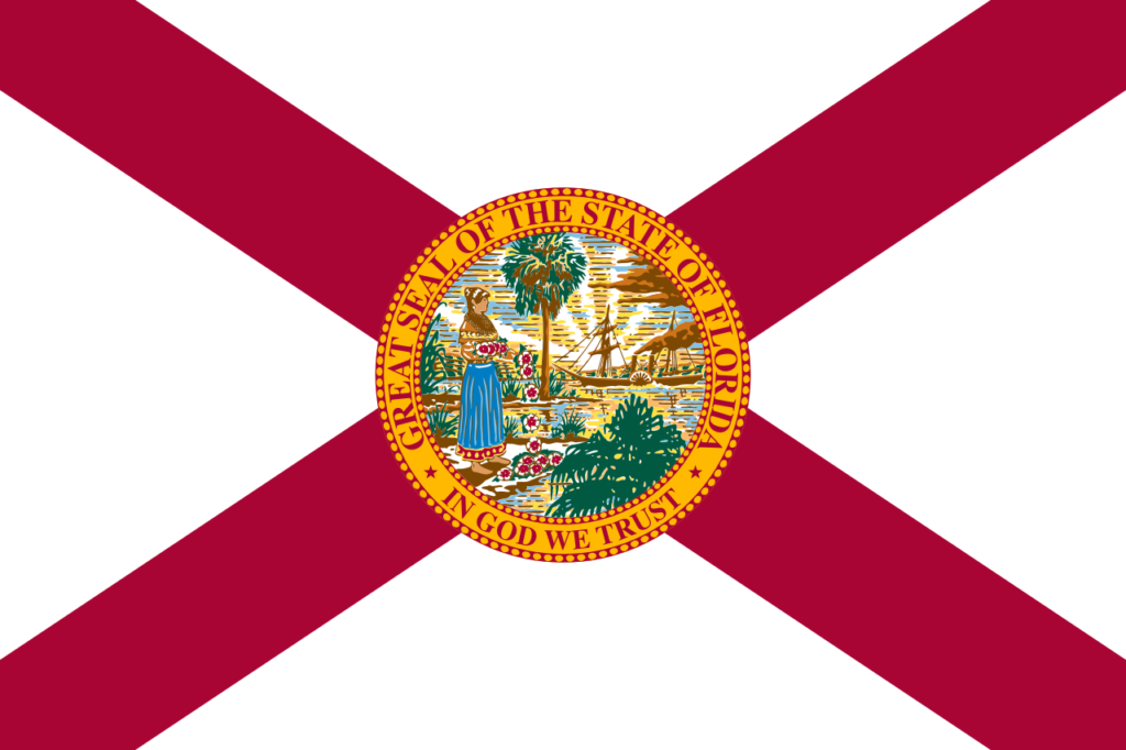
1. KEEP IT SIMPLE | Rating: FAIL
The flag is not simple. The central seal is a detailed, intricate artwork containing a landscape with a palmetto palm, a steamboat, a Native American woman in a Greco-Roman dress, and scattered flowers. This level of detail is impossible to discern at a distance, on a moving flag, or when reproduced in small sizes. A child could not draw it accurately from memory.
2. USE MEANINGFUL SYMBOLISM | Rating: PROBLEMATIC & IMPERIAL
The symbolism is historically loaded and problematic. The seal’s central image depicts a Native American (Seminole) woman in anachronistic classical attire, scattering what are indeed meant to be “flowers of the land” (often misinterpreted as Hawaiian leis) toward an incoming steamboat on water, with a sabal palmetto tree in the background.
- Imperial Narrative: This scene romanticizes a colonial “welcome” and submission, symbolizing the yielding of the land and its people to incoming European settlers and technology. It erases the reality of conflict, displacement, and the Seminole Wars. The imagery is a product of its 19th-century origin, promoting a Manifest Destiny ideology unsuitable for a modern, diverse state.
- The “Dashboard Hula Girl” Effect: The pose and action of the figure are eerily reminiscent of a novelty car decoration; a trivializing comparison that underscores the seal’s failure as dignified, timeless symbolism.
3. USE 2-3 BASIC COLORS | Rating: PASS (but wasted)
The flag uses a simple and effective color scheme: a red saltire (diagonal cross) on a white field. This alone provides excellent contrast and visibility. However, this strength is utterly destroyed by the placement of the multi-colored, complex seal directly on top of it.
4. NO LETTERING OR SEALS | Rating: SEVERE FAIL
This is the flag’s cardinal sin. It places the great seal of the state—designed for documents, not fabric—directly in the center. Seals are meant to be read at close range, not seen flapping on a pole 100 feet away. The seal also includes the words “GREAT SEAL OF THE STATE OF FLORIDA” and “IN GOD WE TRUST,” violating the principle against lettering. This makes the flag a “seal-on-a-bedsheet,” the most common and criticized design flaw in U.S. state flags.
5. BE DISTINCTIVE OR BE RELATED | Rating: FAIL (Non-Distinctive)
This is a critical failure. The underlying design—a red saltire on a white field—is virtually identical to the Flag of Alabama. Florida’s flag is essentially Alabama’s flag with a burdensome seal slapped in the center. It therefore fails to be distinctive on its own. From a distance, without the seal visible, it is indistinguishable from Alabama’s flag, a major flaw for a state with such a strong individual identity.
Analysis: The Flag of Florida
Overall Judgment: A poorly designed flag that violates core principles, primarily due to its central seal. It is non-distinctive, complex, and fails as an effective symbol.
Rationale for Redesign
The current flag warrants a redesign for the following synthesized reasons:
- It’s a “Seal-on-a-Bedsheet” Clone: Its primary architecture is plagiarized from Alabama, making it inherently unoriginal. The addition of the seal doesn’t correct this; it exacerbates it by adding a layer of poor design on top of a borrowed one. Its also based on a white field, a.k.a. The Flag of Surrender.
- The Central Seal is Illegible and Inappropriate: The seal’s complexity renders it a blur at a distance. Its symbolism promotes a dated, imperialist narrative that does not represent the full history or people of modern Florida.
- It Wastes a Good Foundation: The red saltire on a white field is a strong, simple, and recognizable pattern (historically derived from the Spanish Cross of Burgundy, relevant to Florida’s history). A successful redesign would leverage this strong foundation by removing the seal and incorporating simple, meaningful symbols that reflect Florida’s unique environment (e.g., the sun, citrus, waterways, the space coast, the orange blossom) and forward-looking spirit.
Redesign Direction
A great Florida flag would:
- Keep the historically resonant red saltire or reimagine it meaningfully.
- Remove the state seal entirely.
- Introduce a single, bold, simple symbol that represents Florida’s unique character (e.g., a stylized orange blossom, a sun, a crescent moon referencing its Spanish colonial past, or an abstract form suggesting a rocket, coastline, or manatee).
- Use the 2-3 basic colors already present (red, white, and perhaps a new accent color like orange or aqua) for high contrast and recognition.
In conclusion, the Flag of Florida is a textbook example of poor vexillology. It is a derivative, complex, and symbolically problematic banner that fails to serve as an effective, distinctive, or proud emblem for the state.
A redesign is strongly warranted.